FMP proposal
Section One - My final major project (150 words)
- What is the title of my project?
- What will I work towards producing?
- What is my proposed end point?
- How does this relate to work and ideas from the Pathway stage?
- How does Mock FMP extend my knowledge?
- How does it extend my understanding?
- How does it extend my creative ability?
- Mother and Child.
- Responses to my research using the 2D techniques I have learnt based around depictions of Mother and Child in art history and the meaning I take from the job as a serving mum.
- I want to produce a painting that sums up my delve into this area of art and reflects my view.
- Means I can develop techniques and skills I've been introduced to which are brand new to me.
- Contextual research into areas of art history which are probably new to me. Visits to exhibitions that I may not normally have visited.
- Opportunity to fill in gaps in knowledge and frame other ideas information I've been taught.
- By revisiting painting and 2D techniques I feel that my overall creative abilities can only be improved.
Section Two - Influences, Research, Sources and Ideas (150 words)
- What are my influences, starting points and contextual references?
- Why are they relevant to my ideas?
- What subject area do I intend to research?
- How will I research this idea and extend my knowledge?
- Influence: Being a mother of a boy and the rollercoaster of everything that involves. Starting Point: The Klimt of Mother and Child on my bedroom wall. Shows a loving warm depiction of motherhood, but that's only one side of the story. I'm interested in finding out more about how the mother and child relationship has been depicted throughout art history. Contextual References: A look at art history, but want to focus my attention to modern art. I want to find out more about Picasso, Klimt, Matisse, ??? and others as yet undiscovered. Female artists?
- Because I want to use my own experiences of motherhood to portray a feeling/viewpoint/moment in time in the work I create rather than an accurate portrait of a mother and child. They were masters at this so best place to start.
- Modern art era - sculptures, painters
- My knowledge is limited as you can see from the list above. Any new information will extend my knowledge.
- Barbara Hepworth did work inspired by mother and child. I will check out her work when we visit the Hepworth Gallery in Wakefield during this half term.
Section Three - Techniques, Processes and Timescale (150 words)
- What techniques and processes do I intend to use?
- What range of materials will I use to develop these ideas?
- Where and how will I work on this project?
ANSWERS
- Life drawing, drawing, painting, cutouts, assemblege, abstract
- Paint, paper, stuff at college... resourcefulness wherever possible rather than going out and buying resources.
- Work on it at college in 2D studio. Will keep paper sketchbook which I will use as a source of material for a sketchbook which will sit alongside finished work in exhibition. Do some initial research to open my eyes to the possibilities and then focus on a different aspect of Mother and Child each week. I don't know what these are yet, but they will not all be fluffy bunnies - I want to look at motherhood warts and all. I need a topic a week to keep pace to project and a sense of urgency. I can then choose evaluation point to review work and allocate time to produce final piece of work.
Timescale for project - Exhibition of final work at college week commencing 23 June.
Section Four - Method of evaluation
- How will I critically review and analyse my work?
- How will identify directions for ongoing development?
- How will I record the critical response to my ideas?
- How will I assess the success of my Mock FMP?
- Peer review, interim/ongoing review with tutor, ongoing research.
- Discussion generated from analysis done.
- Blog, sketchbook, self reflection in artist diary.
- Feedback and self evaluation. My aim is to enjoy the process and extend learning.
Week One: 22 April
Artist research and idea developmentBefore research, when I think of mother and child I think Mary with Jesus. I've seen loads of images depicting this relationship in galleries. Whilst the painting is amazing and detailed, these pictures have always left me a bit cold. Perhaps because I am not religious I find it really hard to relate to.

Fra Angelico (Italian, ca. 1390/95-1455)
The Virgin of Humility, ca. 1436-38
Tempera on panel
29 1/8 x 24 in.
Rijksmuseum, Amsterdam, Netherlands
© Rijksmuseum, Amsterdam
In my bedroom I have a big picture of Gustav Klimt's Mother and Child which I foraged from a charity shop for £2. I really like it. I connect with it. It makes me feel serene and think about those calm uncomplicated moments mother and child share sometimes.

Watched a programme about Klimt. A Peter Pan at home with mum and sister, but a womaniser with passionate relationships and many illegitimate children. He was obsessed with the embrace, love and women. A year after The Kiss shown in Vienna (1907) the surrealism movement started and his work suddenly seemed dated.
http://www.dailymotion.com/video/x1ayfs7_the-life-and-art-of-gustav-klimt-artist-history-biography-documentary_creation
Gustav Klimt
Gustav Klimt (July 14, 1862 - February 6, 1918) was an Austrian Symbolist painter and one of the most prominent members of the Vienna Art Nouveau (Vienna Secession) movement. His major works include paintings, murals, sketches, and other art objects, many of which are on display in the Vienna Secession gallery. Klimt's primary subject was the female body, and his works are marked by a frank eroticism--nowhere is this more apparent than in his numerous drawings in pencil.
Klimt was born in Baumgarten, near Vienna, the second of seven children, three boys and four girls. All three sons displayed artistic talent early on. His father, Ernst Klimt, formerly from Bohemia, was a gold engraver. Ernst married Anna Klimt (nee Finster), whose unrealized ambition was to be a musical performer. Klimt lived in poverty for most of his childhood, as work was scarce and the economy difficult for immigrants.
SOURCE: http://www.klimtgallery.org/
Next I Googled 'Mother and Child Art History'
http://www.abovetopsecret.com/forum/thread565919/pg1 - An easy read which gives good overview of art history, starting with a statue created by the Ubaid civilization 6,000 - 4,000BC.
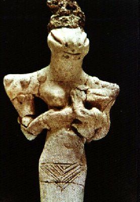
This wouldn't look out of place in an exhibition of modern art. Seeing it reminds me of the work I saw by Rebecca Warren on our trip to London in the Tate Britain. Abstracted form.
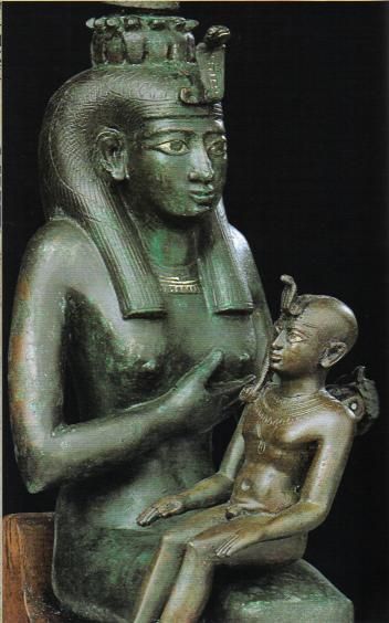
Egyptian statues found that depict Mother and Child are the opposite - loads of detail - the baby looks like a little adult - it really is quite bizarre.
Other ancient civilizations have also depicted the relationship. Hardly surprising really. The world has changed loads, but giving birth to a child or becoming a parent has remained constant - life experiences don't get much bigger than that, so I guess that inspired ancient artists.
Once Christianity begins around 2,000 years ago, the image of Mary and Jesus becomes really popular - and for me a little bit 'seen one, seen them all'.
Moving into more modern and contemporary art, Google tells me that the go to woman for mother and child images is Mary Cassatt.
Mary Cassatt
From Mary Cassatt website: http://www.marycassatt.org/
Mary Stevenson Cassatt (May 22, 1844 - June 14, 1926) was an American painter and printmaker. She lived much of her adult life in France, where she first befriended Edgar Degas and later exhibited among the Impressionists.
Cassatt (pronounced ca-SAHT) often created images of the social and private lives of women, with particular emphasis on the intimate bonds between mothers and children.
Impatient with the slow pace of instruction and the patronizing attitude of the male students and teachers (at the Pennsylvania Academy of the Fine Arts , she decided to study the old masters on her own. She later said, "There was no teaching" at the Academy. Female students could not use live models (until somewhat later) and the principal training was primarily drawing from casts.
Cassatt's popular reputation is based on an extensive series of rigorously drawn, tenderly observed, yet largely unsentimental paintings and prints on the theme of the mother and child. The earliest dated work on this subject is the drypoint Gardner Held by His Mother (an impression inscribed "Jan/88" is in the New York Public Library), although she had painted a few earlier works on the theme. Some of these works depict her own relatives, friends, or clients, although in her later years she generally used professional models in compositions that are often reminiscent of Italian Renaissance depictions of the Madonna and Child. After 1900, she concentrated almost exclusively on mother-and-child subjects.In 1891, she exhibited a series of highly original colored drypoint and aquatint prints, including Woman Bathing and The Coiffure, inspired by the Japanese masters shown in Paris the year before. (See Japonism) Cassatt was attracted to the simplicity and clarity of Japanese design, and the skillful use of blocks of color. In her intrepretation, she used primarily light, delicate pastel colors and avoided black (a "forbidden" color among the Impressionists). A. Breeskin, of the Smithsonian Institution, notes that these colored prints, "now stand as her most original contribution adding a new chapter to the history of graphic arts technically, as color prints, they have never been surpassed".
The 1890s were Cassatt's busiest and most creative time. She had matured considerably and became more diplomatic and less blunt in her opinions. She also became a role model for young American artists who sought her advice. Among them was Lucy A. Bacon, whom Cassatt introduced to Camille Pissarro. Though the Impressionist group disbanded, Cassatt still had contact with some of the members, including Renoir, Monet, and Pissarro. As the new century arrived, she served as an advisor to several major art collectors and stipulated that they eventually donate their purchases to American art museums. Although instrumental in advising the American collectors, recognition of her art came more slowly in the United States. Even among her family members back in America, she received little recognition and was totally overshadowed by her famous brother.


Mary Cassatt lived in a time when opportunities for women were limited and I don't think they were permitted to do life drawing. Perhaps mother and child were the only subjects available to her. I can appreciate her work but it doesn't provoke an emotional response from me.
Picasso:

Guernica, 1937 by Pablo Picasso. One of Picasso's most famous pictures. Painted in response to the bombing of the Spanish town Guernica - at that time (pre World War II) this was the heaviest bombing of any town by aircraft. The town was devastated and Picasso painted this in response to that. The image of the woman holding her dead baby on the left hand side of the picture shows a whole different aspect of motherhood. When I look I can't help but emotionally connect with her.
Weekend 26/27 April
Put a big piece of paper on the wall and scribbled. Liked working this way. Have folded up this bit of paper and put it in my sketchbook so you can see the detail.


Got a picture of a friend taken during her pregnancy. Sketched it out and then had a go at abstracting the pregnant form.

Also been chatting over mother and child with people. Have got a few new ideas:
Mother and son portraits - for fun really. The boy is up for it and says I will have a tiny head and a massive body... I'm going just going to fill him with sausages!
Think about myself as the child in the mother and child relationship.
Have always had problem with plaster casts and impressions of little hands and feet with vomit inducing sentences about 'little hands and memories...' As a kid on the Isle of Wight, a standard school trip was a visit to Osborne House - Queen Victoria's favourite house during her reign. She had many children and built a Swiss COttage in the grounds for them to play in. SHe also had a room in the house filled with plaster casts/mable impressions of her children's limbs. They filled the world floor to ceiling. 'Beatrice - Arm aged 5' As a kid I found it really bizarre and a bit spooky, and I guess it has never left me!
As a protest me and Ike could do our own memory imprints, but using our bottoms! A kind of finger up at the cute, mainstream 'things you are supposed to do' mindset.
Now I have a handle onthe topic, I need to talk to others, pick their brains and bring in new influences to continue exploration as I don't feel I have found what it is I want to make yet.
Helen (Arts Development Manager at darts and a visual artist) mentioned Louise Bourgeois as a good artist to check out whose work included exploration of her relationship with her mother. A big spider apparently with blades for legs as mother was seamstress. Am intrigued.
http://www.theartstory.org/artist-bourgeois-louise.htm - great resource on Bourgeois
http://www.edinburghlbb.co.uk/whatson/event/louise-bourgeois-edinburgh/
Is showing now in Edinburgh! until 18 May.
http://www.telegraph.co.uk/culture/culturenews/10410200/Louise-Bourgeois-A-Woman-Without-Secrets-Scottish-National-Gallery-of-Modern-Art-Edinburgh.html
Week Two: 28 April
Artist research and idea developmentExperiments with ink 2D - like the vibrancy and the way with wet paper you just don't know what the outcome will be. Just like raising kids really.
Spoke to Dave about how I can take this forward in an abstract way. We talked about:
- Tension and the push/pull of life/responsibility etc
- Hidden serenity in a shitty sea and how I can use technique and my approach to work to achieve this. A nirvana behind the tension.
- Dave suggested that I look into colour theory and the way colour can create tension. Suggested artists to look at:
American Painter - committed suicide in 1970. At a time when the art world was focused on Andy Wahol style art - pop and pow, Rothko was creating work where he used colour to create solumn art that provoked an emotional reaction. Simon Sharma in this film says that when he saw the paintings they were displayed at the Tate in a room that was dimly lit. The paintings took him to an unknown place - he wasn't sure if he wanted to go there though.
Joseph Albers
American artist who was interested in colour theory. He believed that theory should The pictures I've seen are squares of colour which he started painting at age 62. The film I watched about him shows that the squares were just a tool he used to paint colour. His interest was in the way colours affect each other.
http://www.bing.com/videos/search?q=joseph%20albers&qs=n&form=QBVR&pq=joseph%20albers&sc=4-13&sp=-1&sk=#view=detail&mid=0A989123FDAA85E297F60A989123FDAA85E297F6
There is an ipad ap 'Interaction of colour' where you can play with colours in a way that Albers intended.
Colour theory
https://www.youtube.com/watch?v=6_MqD4k3M4c&feature=player_embedded
I know about the colour wheel and basics of contrasting and complementary colours. This film was using colour theory on Photoshop, but the explanation was quite clear. It talked about how warm colours are generally evoke feelings of energy and power, whilst cool colours are more calming and sad. Paintings generally balance these elements within the composition.
Also talks about desaturating colour - like dulling it down - as if you are looking at it after looking at the sun. Saturated colours are bright and vibrant.
Need to ask yourself what type of reaction/emotion do I want to evoke in people looking at my work and choose colours accordingly.
Some good websites for finding good colour combinations:
www.colourschemedesigner.com
www.colourcombos.com
Great video about colour - explores how primary colours are not red, yellow and blue but yellow, cyan and magenta. These are the colours used in printers and photocopiers. Also used by printers and designers that I've worked with.
http://scottnaismith.com - really clear explanation.
Spoke to Jon about tension, balance in life, change all bought about by having kids. We talked about developing my mother and child idea and taking the feelings and emotions attached to that relationship and exploring them in a forward looking way, rather than a retrospective of my experiences of motherhood and childhood.
Thinking also about tension: A definition: 'tension, a balance maintained in an artistic work between opposing forces or elements; a controlled dramatic or dynamic quality.'
http://www.vanseodesign.com/web-design/visual-tension/
I need to think more about the real feelings I am trying to deal with in this project. What do I want to portray and how do I want to do it?
1 May
Have been mulling the idea of tension - had a few ideas about how I could portray this in sculpture and 2D abstract. When I did Alice in Wonderland in a lesson we sat and tried to come up with 10 ideas for work. This worked really well for me and my final work was a combination of these ideas. I'm going to do that again and see what comes out.
SKETCHBOOK


Umbilical idea (2D):
Taking an image of me and Ike, blowing it up to A1 or as big as I can then cutting it into squares and rearranging these on paper and then painting over it so that only a bit of the image remains. This kind of signifies to me how once a child is born that exclusive one-to-one relationship is lost. Once the cord is cut, that close relationship is changing and this continues as the child grows and becomes more independent. Life and the different paths through life that a mother and child take can then further fragment that relationship, but at moments there is real closeness and connection, but these moments don't always happen, so you only see glimpses through the paint. I'd take Dave's advice and think about the technique I use to paint - bold, harsh, fragmented etc. Then if I included the umbilical cord I'd paint this in a soft. curved different way to contrast.
David Hockney - in his stuff at Salts Mill there was some photo montages which I kind of like, but not really a fan of his stuff, but might be worth reviewing his montage stuff.
Under the skin of motherhood (2D):
Many images of mother and child are cute, and rose tinted. Perhaps I could strip this away and show a mother cradling her child depict her muscles rather than skin - get under her skin to feelings rather than outward appearance. Could look in books at how the muscles are arranged on a skeleton and then abstract/crop this so that it isn't obvious what you are looking at. The 'baby' could be depicted as an egg or similar - again using softer/curved brushstrokes to contrast the strength of muscles - could also contrast colours.
Life lottery (3D)
Thinking about the nest as a symbol of nurture and safety alongside the idea that birth is a lottery and it is complete chance whether as a child you end up in a nest that will nurture or a nest that will destroy. Some don't end up in a nest at all. Would be fun to explore this idea further. Perhaps I could make nests out of different materials - eg. nails or feathers and then set up a bubble machine to release 'eggs' into the air. Some of these would make it to a safe nest, some would be popped as soon as they touched the sharp nest - others wouldn't make it to a nest at all. Think it would be fun to look at there would be tension created as you would never be sure where the bubbles will land.
Talked to Jon re these ideas and he pointed me towards Damien Hirst: History of Pain - a plinth with knives and a big balloon above them. The balloon drops and then just as it reaches the blades, a fan kicks in an lifts it again away from the blades.

Source: http://www.damienhirst.com/the-history-of-pain
‘The History of Pain’, was first shown at Hirst’s major solo exhibition, ‘Theories, Models, Methods, Approaches, Assumptions, Results and Findings’ at Gagosian Gallery, New York, in 2000.
The piece acts as a contradiction to the childish buoyancy of another key work in the ‘Mental Escapology’ series, ‘Loving in a World of Desire’ (1996). The beach ball colour palette of the first work is replaced with pure white in ‘The History of Pain’. The slightest interruption to the supporting air supply will result in the ball’s immediate puncture by the surgically sharp knife blades piercing the base.
‘The History of Pain’ has been included in three large surveys of Hirst’s work, ‘The Agony and the Ecstasy’, Museo Archeologica Nazionale, Naples, 2004, ‘Requiem’, PinchukArtCentre, Kiev, 2009 and ‘Cornucopia’, Musée Océanographique, Monaco, 2010).
Also suggested that I look at Mother and Child Divided
Source: http://www.tate.org.uk/art/artworks/hirst-mother-and-child-divided-t12751
Mother and Child Divided is a floor-based sculpture comprising four glass-walled tanks, containing the two halves of a cow and calf, each bisected and preserved in formaldehyde solution. The tanks are installed in pairs, the two halves of the calf in front of the two halves of the mother, with sufficient space between each pair that a visitor may walk between them and view the animals’ insides. Thick white frames surround and support the tanks, setting in brilliant relief the transparent turquoise of the formaldehyde solution in which the carcasses are immersed. The sculpture was created for exhibition at the 1993 Venice Biennale and was subsequently the focal point of the 1995 Turner Prize at Tate Britain (then The Tate Gallery), the year that Hirst won the prize. It is now in the collection of the Astrup Fernley Museum of Modern Art, Oslo. Hirst created Tate’s copy for exhibition in the Turner Prize Restrospective at Tate Britain in 2007.
I think this work is clever - physically separating mother and child who are traditionally seen joined or close together. I think the fact that the gallery visitor can walk between the sculpture means that almost by default they are more engaged with the work than they would be if the just stood and looked at it.
http://www.artlyst.com/events/mother-and-child-the-photographers-gallery
Week Three: 6 May
Time to decide on the focus of my FMPEvaluation of research and ideas.
After a couple of weeks of idea development and talking to as many people as I can, my head is a whirl which is cool but I need to make a few choices and be honest with myself: I don't want to be working every hour of day and night to get average work finished. I'd rather do one piece of work which could work out average or brill (or shit) but will have enjoyed the process and that's what being at college is all about for me.
Have had loads of ideas, some that I really like, but have decided I'm going to focus on the memory quilt idea. My reasons for this are:
- It is textiles based which is my favourite subject and I have some experience and knowledge from before I started this course.
- I can develop my newspaper ideas from the first fabric manipulation techniques unit that I did with Jackie.
- I can bring in quite a few of the ideas and influences that I have researched into one piece. ie. tension and colour theory.
- I can work in a book as well as the computer, but understand that there will need to be some cross-over between these and I need to be careful how I reference this so my work makes sense to assessors. All my artist research and links will be on here, but the development of my ideas and the artist references that influence me etc will all be developed in my sketchbook.
- Would look good in the exhibition . Have thought about how I can display this in the exhibition.
[kwilt]
A coverlet for a bed, made of two layers of fabric with some soft substance, as wool or down, between them and stitched in patterns or tufted through all thicknesses in order to prevent the filling from shifting.
What is a memory quilt:
http://www.patchworkmemories.com/products/memory_quilts/custom_memory_quilts/custom_memory_quilts.html
They are pretty vomit inducing to be honest. They are a way of putting memories together in a sewn item and changing them into something that can be used. Often they are created from baby clothes and also from the belongings of people who have died.
Here are some memory quilts:
Obviously these are cute, very craft based and pretty horrible. How any person with a small child has time to make one of these is beyond me. They show off a perfect world at the centre of which is a perfect little human and is a million miles from my experience and the experiences of many people that I know.
I want to make a quilt that shows the reality of motherhood and display this on a bed. The top of the quilt would be neatly placed on the bed - prim, proper and as it should be. The bottom of the quilt will contrast this. Falling off the bed, unfinished, torn at the edges, made from paper, showing some reality creating some tension and contrast in the piece. I also want to use colour theory to bring maximum impact to this contrast.
Next steps:
Revisit the brief that I wrote for myself at the beginning - redo this based on the decisions I have made.
Take pictures of quilts on beds and do some drawings of these.
Start looking at materials and techniques I could use to make the quilt. Primary research.
More idea generation focussed on the quilt, rather than the overall theme of Mother and Child.
Have other artists done this? Do some research and find out.
Make a model of the ideas I see in my head so that I can start to make it physical for other people and then get their feedback on my idea.
How am I going to translate these thoughts into visual arts?
- Thinking about layers - the creativity beneath the oily veneer of mass media mediocrity.
- Thinking about tension in art - contrast of techniques to evoke different feelings
- Want to use newspaper - I always comeback to this - is it because I work in the media where results are measured by appearances in a newspaper/coverage? The media want us all to follow their advice, buy their paper/subscribe to their channel. Everything worthy of appearance/column inches is also the biggest and the best. This is because these ideas are being sold to journalists by people with a very fixed agenda and these journalists are being 'persuaded' to cover these stories. The stories that don't fit this mold do appear sometimes, but they are few.
Friday 9 May
In textiles class we looked at fabric manipulation techniques. I focused on Mola. Traditional Mola technique comes originally by the women of the Kuna tribe. The tribe lives in Panama and use the craft to make clothes.

They tend to use bright colours in their designs. It is a kind of reverse applique where layers of fabric are sewn together and then sections are cut away to reveal different colours underneath. The cut edges are then finished/tidied by hand. The work is beautiful, precise and takes a long time to complete.
I had a go at this technique in class - here are my experiments:
SEE SAMPLES IN MY SKETCHBOOK
I like this technique. It has great play potential. The traditional designs look very similar to each other - the colours must be traditional and have significance to the tribe - or, perhaps is controlled by the dyes available to the tribe in their local environment.
It's a great way to bring the ideas of hidden creativity to life and illustrate this in a visual arts context. I'm going to do some experiments around this. I have a few ideas at this point to play with:
Mola on a canvas. Newspaper on the top, layers attached behind the canvas with print, magazines and bright colours behind. I'd rip through the canvas to reveal colours beneath. Think I need to experiment with this then evaluate the results to come up with the next step.
Week Four 12 May
Bit of a change of direction. Over the weekend I started to go off the quilt idea. It's too craft, too safe feeling, but I do enjoy textiles and have some aptitude for them so I want to play using some of the techniques I have learnt.Spoke to Jon about creativity in children and how parents and schools seem hell bent on destroying this in our kids. This is a tragedy.
I know from experience at work, that even when kid's parents are disengaged with creativity, kids forge on regardless, releasing their imaginations at a moments notice. As they get older, it is like their powers become diluted by life, mass media, always being told that they have to succeed... Suddenly without warning they are just another unimaginative drone that doesn't question the norm at all and aims to be safe at all times.
Online research: Ken Robinson. This guy is clever - just tells it as it is. He talks about how the education system is shaping our kids to find jobs in a society gearing up for the industrial revolution. That was yonks ago. Is our education system preparing our kids for the future? Only if they are going to be university professors! Where does this leave the other 99% of the population who are not destined to spend their lives wandering drafty halls in creased clothes? Unprepared is the answer. Unprepared to meet the challenges that the world and their lives in it will inevitably bring.
Parents also contribute massively to this destruction of creativity. Generally kids aren't given time to be bored anymore. Being constantly transported from activity to activity in an air conditioned monster car, being supplied with a DS or similar to amuse themselves at all times. Boredom is the first step to creativity.
Ken Robinson
Suli Breaks: This guy is also pretty cool and has an interesting take on life
Other stuff that is interesting fodder:
http://www.webmd.com/parenting/features/being-good-mom
https://answers.yahoo.com/question/index?qid=20081009094203AAAZDfe
http://zenhabits.net/how-to-be-a-great-mom/
http://www.theguardian.com/lifeandstyle/2013/dec/15/how-to-be-a-good-mother
http://www.psychologytoday.com/blog/tech-support/201310/what-makes-good-mother-anyway
https://answers.yahoo.com/question/index?qid=20081009094203AAAZDfe
http://zenhabits.net/how-to-be-a-great-mom/
http://www.theguardian.com/lifeandstyle/2013/dec/15/how-to-be-a-good-mother
http://www.psychologytoday.com/blog/tech-support/201310/what-makes-good-mother-anyway
I want to carry on my thinking in this area.I think this is the bit of the mother and child relationship I want to explore further.
13 May
Had a chat with Dave to clarify my ideas. Student review. I had a think about new aims for work now the subject of Mother and Child has been shaped by my research:
New aims pre chat:
Exploring elements of the theme - focus on the loss of creativity in childhood
Explore layers - latent creativity under the surface
Hope that people looking at my work will think about how this loss of creativity happens and maybe stem this loss of experimentation
Fun stuff created by me and Ike - experiment


Me and Dave talked and kind of reached the conclusion that I should:
'Focus on distilling energy on specific issues which repeatedly constrain and retard a child's creativity and freedom to bloom naturally.'
This is my new aim in a nutshell, and I want to do it by releasing control and working differently...more by instinct and by being led by Ike, who after all has not yet had all the controls dictated by society, adult responsibility and acceptable behaviour applied yet. I will let him lead me.
To help get ideas focused and in order I'm rewriting my original brief:
Revised Section One of Mock FMP Brief
Inspired by experience on both sides of the mother and child relationship, I want to explore the relationship and its affect on creativity. I want to use the instinctive creativity of children to set my direction and influence my work.
I want to try and step back into a child's shoes and relinquish control. See what happens. This means my final outcome is unknown and the techniques I'll use are unknown.
I'm a result of a typical school life and years of work where your focus is always good results. I accept that this project may fail, but I'm more excited by that prospect than any of the techniques or skills I've learnt. This approach will teach me more than anything else.
14 May
did some painting - no planning just got going and didn't think. Acted on impulse - if I had an idea I'd do it. Here's a couple of the results:


Obvious that Mother and Child themes have emerged, but none were preplanned. Have decided to offer Ike the opportunity to finish these paintings. He was only interested in one:

He made it into this:


Wiki ref:
Automatic drawing[edit]
Automatic drawing (distinguished from drawn expression of mediums) was developed by the surrealists, as a means of expressing the subconscious. In automaticdrawing, the hand is allowed to move 'randomly' across the paper. In applying chance and accident to mark-making, drawing is to a large extent freed of rational control. Hence the drawing produced may be attributed in part to the subconscious and may reveal something of the psyche, which would otherwise be repressed. Examples of automatic drawing were produced by mediums and practitioners of the psychic arts. It was thought by some Spiritualists to be a spirit control that was producing the drawing while physically taking control of the medium's body.
Automatic drawing was pioneered by André Masson. Artists who practised automatic drawing include Joan Miró, Salvador Dalí, Jean Arp and André Breton. The technique was transferred to painting (as seen in Miró's paintings which often started out as automatic drawings), and has been adapted to other media; there have even been automatic "drawings" in computer graphics. Pablo Picasso was also thought to have expressed a type of automatic drawing in his later work, and particularly in his etchings and lithographic suites of the 1960s.
Most of the surrealists' automatic drawings were illusionistic, or more precisely, they developed into such drawings when representational forms seemed to suggest themselves. In the 1940s and 1950s the French-Canadian group called Les Automatistes pursued creative work (chiefly painting) based on surrealist principles. They abandoned any trace of representation in their use of automatic drawing. This is perhaps a more pure form of automatic drawing since it can be almost entirely involuntary - to develop a representational form requires the conscious mind to take over the process of drawing, unless it is entirely accidental and thus incidental. These artists, led by Paul-Emile Borduas, sought to proclaim an entity of universal values and ethics proclaimed in their manifesto Refus Global.
As alluded to above, surrealist artists often found that their use of 'automatic drawing' was not entirely automatic, rather it involved some form of conscious intervention to make the image or painting visually acceptable or comprehensible, "...Masson admitted that his 'automatic' imagery involved a two-fold process of unconscious and conscious activity...."[1]
Week Five 19 May
Disco Party Canvas ExperimentGot hold of a large canvas. Idea is to let Ike paint it completely as he wishes. No rules and with the exception of life threatening scenarios, no rules. I've told him that he can ask me for any materials he wants and do whatever he wants.
I want to observe only. No responses to open questions - will just turn them back at him. Only respond to direct orders for materials. No reassurance or advice.
PLEASE SEE THE MEMORY STICK WITH MY SKETCHBOOK WHICH HAS SOME VIDEOS OF THIS PARTY CANVAS EXPERIMENT


At this stage he is still asking approval seeking questions and advice about what materials he should use. I'm nice but turn them all back on him. So off he went. Gradually he started to move more and was singing and vocal all of the time. He started to squirt the paint onto the canvas direct from the bottle and then picked it up and threw it at the canvas. He looked happy and as if he knew exactly what he was doing.

Absolutely love this picture! He's stuck into what he is doing here. The controlling mum/student in me had a mini crisis at this point... What he'd done actually looked quite good and in the back of my mind I'm thinking: 'That would look good in my exhibition', but I resisted the urge to control and let him carry on.


What followed can only be described as ferrel. He was completely covered in paint and was using all parts of his body to paint. He was using his bottom to paint. He looked like a dog with an itchy bottom when they do that carpet skiing thing...


At the end he was using bits of cartridge paper and rubbing them into the painty surface, then pulling it off which left a relief in the paint on the canvas. Then suddenly - without warning it was finished.


PLEASE LOOK AT MEMORY STICK FOR FILMS
Conclusions
Brown. Lots of brown. Visually not very inspiring. Umm don't think I took a picture.
The thing that I found most interesting about this was that when Ike was in the zone he moved continually, he sang, muttered, hummed - for him movement and being articulate are key to creativity.
20 May
Took brown masterpiece into college. Dave's advice: take some macro shots using the camera on a tripod to see the inner beauty revealed beneath. Worth a try. Results quite surprising:


Hidden depths after all! Dave suggested using photoshop to mess with colour, saturation etc. I could, but am always going to want to try a hands on materials approach first as computer based work doesn't do it for me really. Decided to do some more painting experiments based on the macro images and my observations of Ike creating the disco canvas.


Used strips of paper and pulled them from canvas as Ike did. Results - hmm average. Not happening.
21 May - Trip to Yorkshire Sculpture Park and Hepworth Gallery
Checked out the work by Barbara Hepworth inspired by Mother and Child:


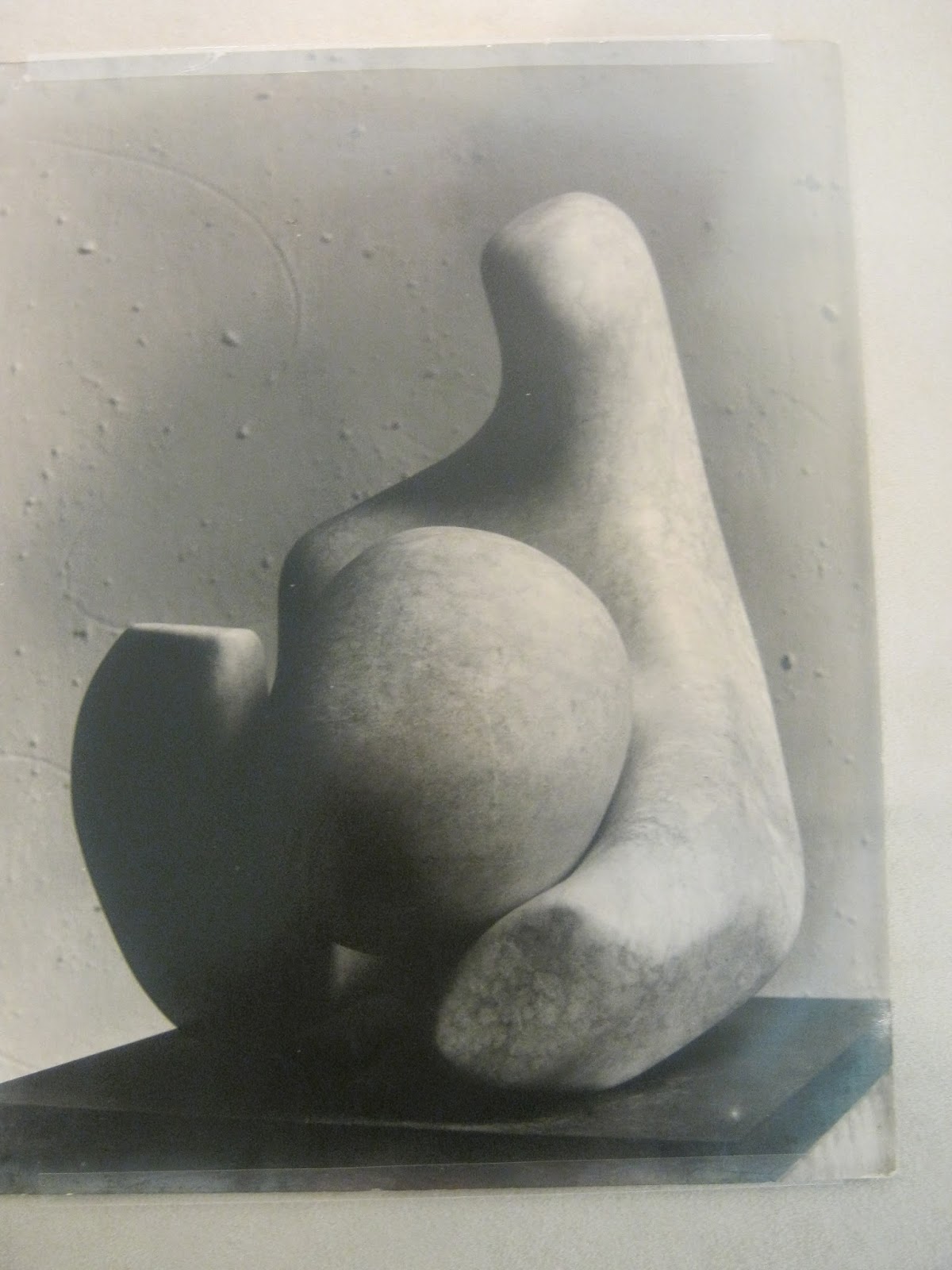
Barbara Hepworth Sculpture. Interesting work. Kind of quietly beautiful. Would have liked more time to look and will visit again over the summer.
Yorkshire Sculpture Park - great afternoon. Art and nature. Sitting waiting for the bus I was mulling over my project and the jazz canvas experiment and looking back in my sketchbook at some of my previous ideas. Returned to the idea of tension which has been absent from my thoughts for a couple of weeks.
Randomly straitjackets sprung to mind as a great metaphor for controlling creativity. Nothing more efficient at stopping you move. Victorian connotations of strait jacketed patients strapped to beds in hospital wards. Also there is the Houdini element - he escaped from a straitjacket in one of his famous tricks.
Potential here to create some tension. Will the child ultimately escape or be controlled?
Looked for images of straitjackets:


I think the crossed arms is strong visually and perfectly sums up what I want to say Did a search on children's straitjackets wondering what I would come across. Found this:


Kind of scary...
Found some good images of Houdini. I like the old fashioned weights and chains he is using in this one. They look good and the idea of being weighed down and trying to escape fits where my head is at.

Week 6 - 2 June
Did some sketching over half term holiday and chucked about the idea of straitjackets and weights a bit. SEE MY SKETCHBOOK HERE FOR PICS AND MORE REASONS FOR THE CHOICES I'VE MADE IN MY WORK


An idea has formed in my head. A kind of sculpture that describes the tensions that I face as a mother in raising my child. Conflict between the things I am told are right as defined by government rules, education guidelines and society's expectations.
It starts from birth. 'Your baby should follow this line of growth and achieve twice his birth weight at six months...' 'At the end of Key Stage One your child should reach prescribed levels of literacy, numeracy etc...' 'Boys can't wear pink wellies and have long hair...' And then they preach to us that 'Every Child is Different'. Something doesn't add up...
Image research

Evacuees had labels hung around there necks to identify them. Sensible in the situation, but makes the images seem even more harrowing. They are not only leaving their homes and families, but they also lose their voice in a really visual way. I want to use this on my work. Going to find a quote that sums up what I want to say. SEE SKETCHBOOK FOR QUOTES RESEARCHED.
Images of asylum patients in straitjackets. Horrible. Gives me shivers.
Week 7 - end of project - 9 June - Making my final piece
Action stations... Lets get making. Final piece has a number of elements:
Straitjacket
Started off with the straitjacket. I took an old jacket of Ike's and adapted it by adding length to the sleeves to make it into a straitjacket.

I mocked up an impromptu body form using old clothes and hung it on a hanger so that I could mock up how the jacket would look.

I turned the jacket around and made the back the front. Initially I pinned the extended arms to the sleeves to see how it would look.


This is heading in the right direction so attached the extended arm sections to the jacket sleeves.


Referred back to pictures of straitjackets researched. Need to add straps and buckles to give it an authentic look. Had a look through my store of 'things I might be able to use one day....' Found the buckles that I cut of an old pair of boots. perfect.

I attached these straps to the back of the jacket using a glue gun.
I bought a hanging child form from the internet because my impromptu body form kind of does the job, but I want to hang the finished jacket from fishing line so it looks like it is floating so I need a lightweight form. Found one for £5.

On my mock-up, the arms looked deflated so I decided to create fake arms using tights, wadding and cardboard to give some structure.


When I added the jacket to the new body form I realised that the bottom of the form hung below the line of the jacket. Did consider making something to cover this bit, but I want the jacket to look like it is suspended and I think this would spoil the effect so I'm going to cut off his legs and crotch!

The view from beneath

Next step was to add the straps. I found the satin-effect material in the textiles fabric store and made a long tube that I turned through and press flat. This was then glued to the extended arms of the jacket to create straps.


Weights
Decided to use weights and chains for a couple of reasons. Firstly as a symbol of being weighed down and constrained, unable to move... The second relates to Houdini and the fact that escape is possible even though it looks impossible.
Continuing the kids stuff theme when sourcing materials, I decided to make the weights using three of many flat footballs in the garden outside my house.

I covered them in paper mache to give a smoother surface which I could paint.

To make the loops to hold the chain I made a loop of wire (of course while I was doing this I was wearing safety glasses and wore gloves).


I then wrapped the metal circle in string to make it more chunky.

I then attached the ring to the top of the ball.

Covered the string in paper mache to make it smoother and create a surface I could paint.


Once dry, I painted the weights using a and mixed black paint to make them look like they are made of heavy metal.


Chains
For the chains I decided to use paper chains. Easy to make and also something that fits with the theme as making paper chains is something that I've done with Ike a few times.
Chains were also a great way to get some words into the final piece in a non-obvious way - if you really look you can see the words but because of the way the chains fall, the complete word is not obvious unless you move and look.
I painted a sheet of A2 cartridge paper with my black and grey using a sponge to graduate tone from dark to light.


I then cut the sheet into strips using the guillotine to get standard sized strips

Then I added newspaper to the reverse. Looking back I should have just attached the newspaper to the big sheet before I cut it up, so I made this process a lot more time-consuming.
I chose these words to describe the things I see that restrict a child's creativity:
Expectations: The weight of expectation put on kids by adults is immense and massively restrictive.
Conform: To follow like a sheep, and act, look and think the same as everyone else. I experienced that pressure as a child, and see the same happening to Ike and am powerless to stop it.
Targets: Everywhere - Childhood is teaming with them but most come from school. I think Ike is under more pressure to perform than I was at school. Children in Year 1, aged five shouldn't be given homework - surely that is mad. And this is the first in a long line of targets which I know will continue to spew from the school gates.
To make the words I cut out letters from newspapers and glued them on.

Laid out flat they look pretty good. Expectation is my new screen saver:


Balloons
I choose balloons to be the symbol for creativity and freedom because:
Balloons are playful and move in the air.
They will eventually go down, so my piece has a lifespan.
Balloons are a big deal in childhood.
In our culture balloons mostly found at joyous occasions.
I chose blue, pink and silver balloons rather than red, blue, yellow option. I think decision influenced by the alternative colour wheel in colour theory.

Words on the balloon were made from Angelina Fibres. SEE SKETCHBOOK FOR MORE HERE.
Made sheets of Angelina by ironing between fabric.

To make the letters easier to cut out I used tissue paper.


I used charcoal stick to rub the shape of the letters rather than trying to draw around them with a pencil.

 I used cookie cutters to cut the letters out and then threaded them onto fishing line to hang from the balloons. They twist on the line so again, you have to move a little to read what they say. I also wanted them to be quite transparent in contrast to heavy looking chains.
For me these words sum up kind of lifeblood of creativity and are things I think should be valued and encouraged in everyone really:
Imagine
Failure
Passion
Insight
Risk
Boredom

By accident I bought a single good balloon with the others. I was finishing work off and suddenly had a brainwave - the gold balloon was risk! Of course! Rather than attaching it with the bunch I cut off it's ribboon, counterweighted it with a blob of plasticine and then set it free to roam. Love it.

Neck label
I want to include a quote which sums up what I am driving at with this piece. RESEARCH IN SKETCH BOOK. Choose Picasso:
"Every child is an artist. The problem is how to remain an artist once we grow up."
I wanted it to be hung as a label around the neck - inspired by pictures of evacuees. Being labelled fits the theme of restriction really well.
Finished piece


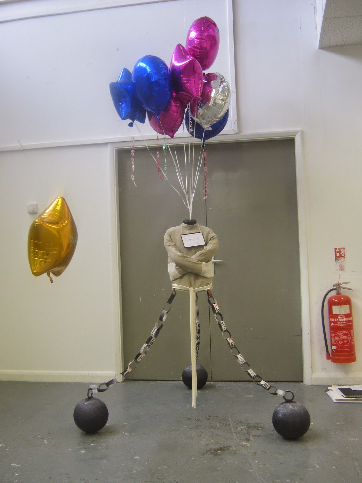
Decided to place my work in front of the grey doors rather than against the white wall. Had more visual impact this way.
Other pieces of work in the room were all black and white. The base of my work is also pretty much monochrome so the balloons had great visual impact when you walk in. This was all by accident, but great that it turned out like that.
I think I achieved some feeling of tension in my work which was an aim. The straitjacket really does look like it is suspended in mid-air and it is hard to say which pull on it will win.
Evaluation
Self evaluation
This project = massive learning curve for me.
Halfway in I decided
I will not conform
I will not worry about targets
Creativity dictates the path I take
I've left layers of clues in my work, and I'm going to be interested to see if people get what I'm trying to say without reading this seemingly endless blog... If they do get it that's great, but it's also great if they see it as just a floating jacket thing that they probably haven't seen before.
The risk balloon - it has lived up to its name and was last seen floating down the corridor...
I've used skills that I've learnt in all three disciplines at college. I mixed my own black for the chains, used papier mache to construct the balls and Angelina Fibres to make my balloon words. This was accidental, but pleases me.
My research was fascinating to me. Eye opening and helped me make sense of some of tensions I feel as a mother between what society dictates, and what I feel is important.
So have I done what I set out to do: 'Focus on distilling energy on specific issues which repeatedly constrain and retard a child's creativity and freedom to bloom naturally.' You know what - to me my piece does exactly this and so I am happy.
By letting creativity dictate I have learnt more than I ever would have by perfecting a particular technique. I've enjoyed the process massively and it will change the way I work in the future. This is exactly what I hoped I'd get out of my college experience. Thanks for teaching me what I needed to know.
Targets: Everywhere - Childhood is teaming with them but most come from school. I think Ike is under more pressure to perform than I was at school. Children in Year 1, aged five shouldn't be given homework - surely that is mad. And this is the first in a long line of targets which I know will continue to spew from the school gates.
To make the words I cut out letters from newspapers and glued them on.
Laid out flat they look pretty good. Expectation is my new screen saver:
Balloons
I choose balloons to be the symbol for creativity and freedom because:
Balloons are playful and move in the air.
They will eventually go down, so my piece has a lifespan.
Balloons are a big deal in childhood.
In our culture balloons mostly found at joyous occasions.
I chose blue, pink and silver balloons rather than red, blue, yellow option. I think decision influenced by the alternative colour wheel in colour theory.
Words on the balloon were made from Angelina Fibres. SEE SKETCHBOOK FOR MORE HERE.
Made sheets of Angelina by ironing between fabric.
To make the letters easier to cut out I used tissue paper.
I used charcoal stick to rub the shape of the letters rather than trying to draw around them with a pencil.
For me these words sum up kind of lifeblood of creativity and are things I think should be valued and encouraged in everyone really:
Imagine
Failure
Passion
Insight
Risk
Boredom
By accident I bought a single good balloon with the others. I was finishing work off and suddenly had a brainwave - the gold balloon was risk! Of course! Rather than attaching it with the bunch I cut off it's ribboon, counterweighted it with a blob of plasticine and then set it free to roam. Love it.
Neck label
I want to include a quote which sums up what I am driving at with this piece. RESEARCH IN SKETCH BOOK. Choose Picasso:
"Every child is an artist. The problem is how to remain an artist once we grow up."
I wanted it to be hung as a label around the neck - inspired by pictures of evacuees. Being labelled fits the theme of restriction really well.
Finished piece
Decided to place my work in front of the grey doors rather than against the white wall. Had more visual impact this way.
Other pieces of work in the room were all black and white. The base of my work is also pretty much monochrome so the balloons had great visual impact when you walk in. This was all by accident, but great that it turned out like that.
I think I achieved some feeling of tension in my work which was an aim. The straitjacket really does look like it is suspended in mid-air and it is hard to say which pull on it will win.
Evaluation
Self evaluation
This project = massive learning curve for me.
Halfway in I decided
I will not conform
I will not worry about targets
Creativity dictates the path I take
I've left layers of clues in my work, and I'm going to be interested to see if people get what I'm trying to say without reading this seemingly endless blog... If they do get it that's great, but it's also great if they see it as just a floating jacket thing that they probably haven't seen before.
The risk balloon - it has lived up to its name and was last seen floating down the corridor...
I've used skills that I've learnt in all three disciplines at college. I mixed my own black for the chains, used papier mache to construct the balls and Angelina Fibres to make my balloon words. This was accidental, but pleases me.
My research was fascinating to me. Eye opening and helped me make sense of some of tensions I feel as a mother between what society dictates, and what I feel is important.
So have I done what I set out to do: 'Focus on distilling energy on specific issues which repeatedly constrain and retard a child's creativity and freedom to bloom naturally.' You know what - to me my piece does exactly this and so I am happy.
By letting creativity dictate I have learnt more than I ever would have by perfecting a particular technique. I've enjoyed the process massively and it will change the way I work in the future. This is exactly what I hoped I'd get out of my college experience. Thanks for teaching me what I needed to know.
No comments:
Post a Comment